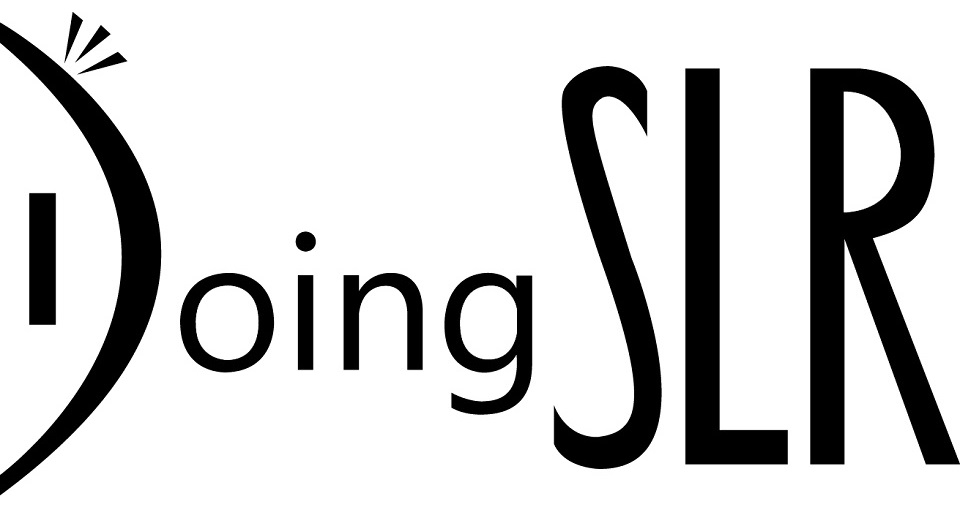
DoingSLR LOGO EVOLUTION
How do you design a logo? Well, the site has to do with photography right. The obvious thing to do is incorporate a camera in the logo. The problem is that I'm not very good at drawing and my sketches quickly taught me that wasn't going to work. Surprisingly, my next attempt was pretty much what you see here. I tried adding underlines and other bits of flare, but I had already managed to hit what I was looking for.
What do I like about this? I was trying for a logo that could both be interpreted to be a lens with a bit of sunlight glinting off the glass or an eye. I was trying to mirror how DSLR technically stands for Digital Single Lens Reflex (Camera) yet here on this site it more importantly stands for the process I go about learning photography. All the pics that will appear here aren't going to just be from my Canon 70D. I still have my Sony Cybershot, and my camera phone.
So I liked the idea of dual symbolism in the logo, but if it tends to look more like an eye than a lens, I'm okay with that too.
Took a I picture of the logo and recreated it in Adobe Illustrator. I built everything at a 100 pixel height to give me a good reference point in the design when getting everything aligned and spaced perfectly. It's the small things that count. I wanted the bottom of the "S" to be a little more level than the top to get some symmetry with the "L." The R's triangle was created with an even 20, 70, and 90 degrees to its angles. The lowercase letters were taken from the Centry Gothic font, but the DSLR are mine.
With that done, it was good enough to put up and see how it would fit with the overall site, but some changes still needed to be made.
While the logo looked fine alone, when I put it up on the site it was clear that the D in Doing looked smaller than the SLR, making the SLR become the dominant part of the logo. That wouldn't do. You can click the image to the right to enlarge it, but even looking at it at it's smaller size should make it clear that the D was too thin to make it feel like it was the right size to make a cohesive "DSLR."
When that was fixed, I saw that the R was a little too bottom heavy, with the angle of the curve too sharp to give it a more cartoonish feel rather than a professional one.
I wanted the SLR letters to look distinct, yet fairly normal when compared to the D. And since the R was on the end it needed to create a strong horizontal finish to the logo rather timidly leaning inward.
So what next? The lashes weren't big enough. They looked fine at the exaggerated size that I was working with, but on the site, and especially in the Twitter logo, they could barely be seen. The final change was to change the circular dot for the Century Gothic font to a slightly tall square. It works either way, but it just feels like it needed to be a square. There are so many right angles and vertical pieces to the logo it felt right.
The final step was to attempt color, but changing the "Doing" to match the orange link color of the site gave the opposite effect of what I was looking for. Because the background color is white, it made the darker "SLR" stand out once again. Until I change the whole color scheme of the site, a solid black logo it is.


